
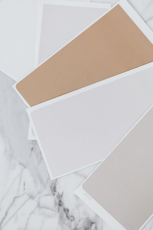
Bringing calm and tranquility into your home starts with choosing the right colors. Calm colors can transform a space, making it feel more relaxing, inviting, and balanced. Whether you want to create a serene bedroom, a peaceful living room, or a calming workspace, selecting colors with intention is essential.
In this post, we’ll share practical tips to help you choose calm colors for your home, with ideas on color families, combinations, and how to create a soothing atmosphere.
What Are Calm Colors?
Calm colors are typically soft, muted shades that have a gentle effect on the mind. They tend to be cool or neutral tones, which reduce visual noise and help the brain relax. Common calm colors include:
– Light blues and soft teals
– Pale greens
– Warm grays and taupes
– Soft lavender and blush pinks
– Creams and off-whites
These colors often mimic natural elements like sky, water, and earth, which is why they feel so grounding and peaceful.
Tips for Choosing Calm Colors for Your Home
1. Start with Your Mood Goal
Before picking colors, think about how you want the space to feel. Are you aiming for restfulness, focus, or gentle energy? Calm colors can vary depending on this goal:
– Relaxation: Choose soft blues, pale greens, or muted lavenders.
– Focus: Soft grays or subtle beige tones can help minimize distractions.
– Gentle energy: Warm neutrals and blush tones add subtle warmth without noise.
Knowing your desired mood helps narrow down the palette effectively.
2. Use the 60-30-10 Color Rule
A popular decorating guideline, the 60-30-10 rule can help maintain balance when using calm colors:
– 60%: Dominant calm color for walls or large furniture pieces
– 30%: Secondary color on upholstery, curtains, or rugs
– 10%: Accent calming tones in cushions, art, or décor items
This creates harmony without overwhelming the senses.
3. Consider Natural Light
Natural light influences how colors appear in a room:
– North-facing rooms get cooler, softer light—warm calm colors like beige or blush can counterbalance this.
– South-facing rooms have bright, warm light—cool calm hues like pale blue or gray work well.
– East or west-facing rooms change light throughout the day—neutral calm tones often provide flexibility.
Test paint samples in different lighting conditions before committing.
4. Choose Matte or Satin Finishes
Finish matters. Matte or satin paint finishes reflect less light, which helps maintain a calm, understated look. Glossy or high-sheen finishes can add energy that might disturb the calm.
5. Combine Colors with Textures
Use textures to add interest within a calm color palette. For example:
– A soft wool rug or linen curtains in pale green or gray
– Natural wood accents to warm up cool tones
– Smooth ceramic vases or woven baskets for variety
Textures create depth without adding visual clutter.
6. Avoid Overly Bright or Saturated Colors
Bright, bold colors are stimulating and can work in certain rooms, but they’re not ideal if your goal is calmness. Stick to muted or pastel versions of your favorite colors to keep the atmosphere peaceful.
7. Use Color Psychology as a Guide
Keep in mind the basic feelings associated with colors:
– Blue: peace, stability, and calm
– Green: balance, growth, and renewal
– Gray: neutrality and quiet
– Lavender: tranquility and softness
– Warm beige or cream: comfort and warmth
While personal preference is key, this can help you choose colors that support relaxation.
Calm Color Ideas for Different Rooms
Living Room
Choose soft neutrals like greige or light taupe for large surfaces. Add calming blues or greens in accent chairs, pillows, and throws. Incorporate natural wood furniture to balance cool tones.
Bedroom
Pale blue or lavender on walls promotes restful sleep. Use crisp white bedding and soft beige or gray furnishings. Layer soft textures like velvet or cotton for a cozy feel.
Bathroom
Soft aqua or mint green evoke freshness and cleanliness. Combine with white tiles and natural stone accents for a spa-like atmosphere.
Home Office
Light gray or muted sage green encourages focus without feeling sterile. Keep accessories minimal and cohesive in calming tones.
Final Thoughts
Choosing calm colors for your home is a wonderful way to create a peaceful retreat from the busy world. By considering your mood goals, natural light, and the power of texture, you can build a color palette that soothes and supports daily living.
Remember, calm doesn’t mean boring—it means thoughtful, balanced choices that invite relaxation and harmony. Take your time sampling colors and envisioning each room’s atmosphere to find the perfect calm colors for your home.